

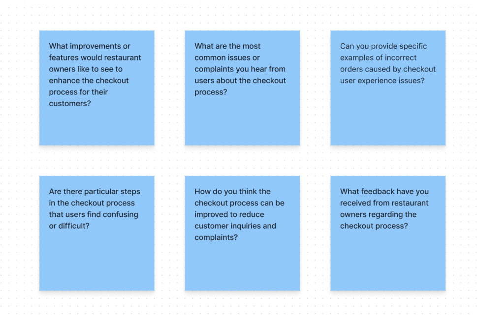
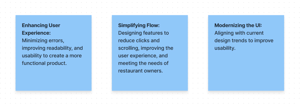
Through our research and usability testing, we identified several key user needs and problems with Vendo’s existing checkout page:
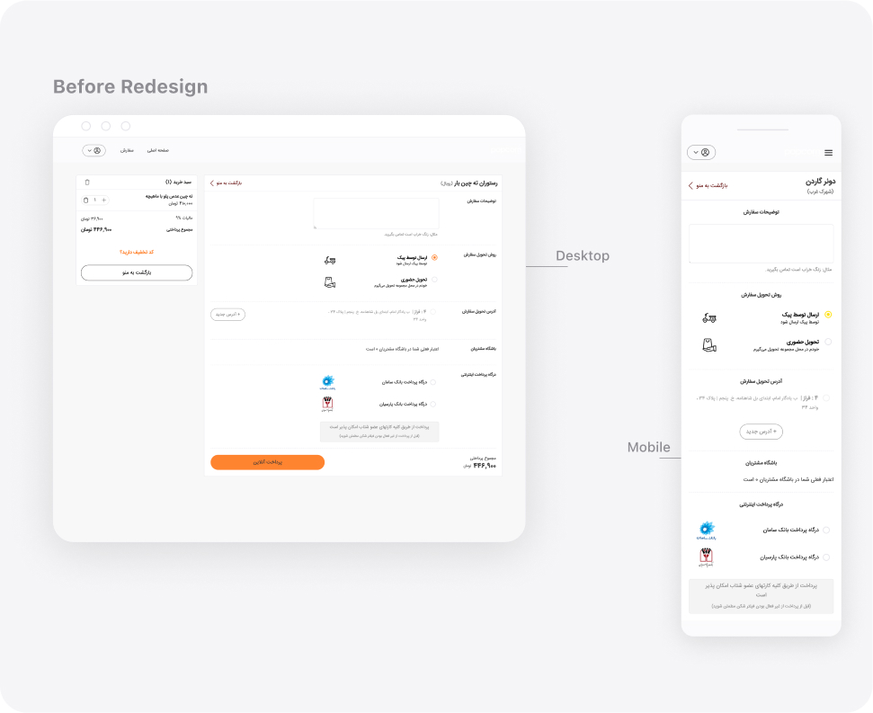
- Hierarchy Issues: The hierarchy of sections led users to overlook or forget some of them. For instance, the “Add Note” section was placed first. Upon entering the checkout page, users focused on more critical tasks like selecting the delivery type and address and ultimately forgetting to add a note.
- Excessive Clicks: Users had to click on and select almost all options, resulting in a high number of clicks and a longer flow.
- Mobile Order Review Challenges: On the mobile version, users found it challenging to double-check their order list easily, leading to errors in order registration.
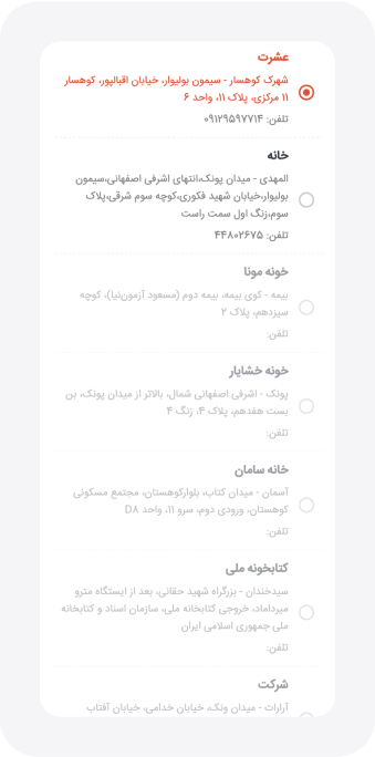
- Low Readability: Low readability negatively impacted the user experience. For example, addresses were displayed in a bullet list format, which became problematic when there were many addresses.
- Mobile Scrolling Issues: In the mobile version, the list and vertical display of items not only lowered readability but also required excessive scrolling.
- Usability of Wallet and Customer Club Sections: The usability of the wallet and customer club sections was inadequate and complex.
- Lack of QR Code Functionality: There was a lack of functionality for scanning QR codes and placing dine-in orders, which restaurants needed.
- Outdated User Interface: The user interface was outdated and did not align with current design trends.
These insights helped us understand our users’ pain points, guiding the direction for redesigning the checkout page to improve usability, readability, and overall user experience.
Ideas Implemented in the Prototype:
- Reorganized Section Hierarchy:
We prioritized selecting the delivery type and address early in the process, moving less critical sections like “Add Note” to later stages. This adjustment aimed to streamline the user flow and reduce errors.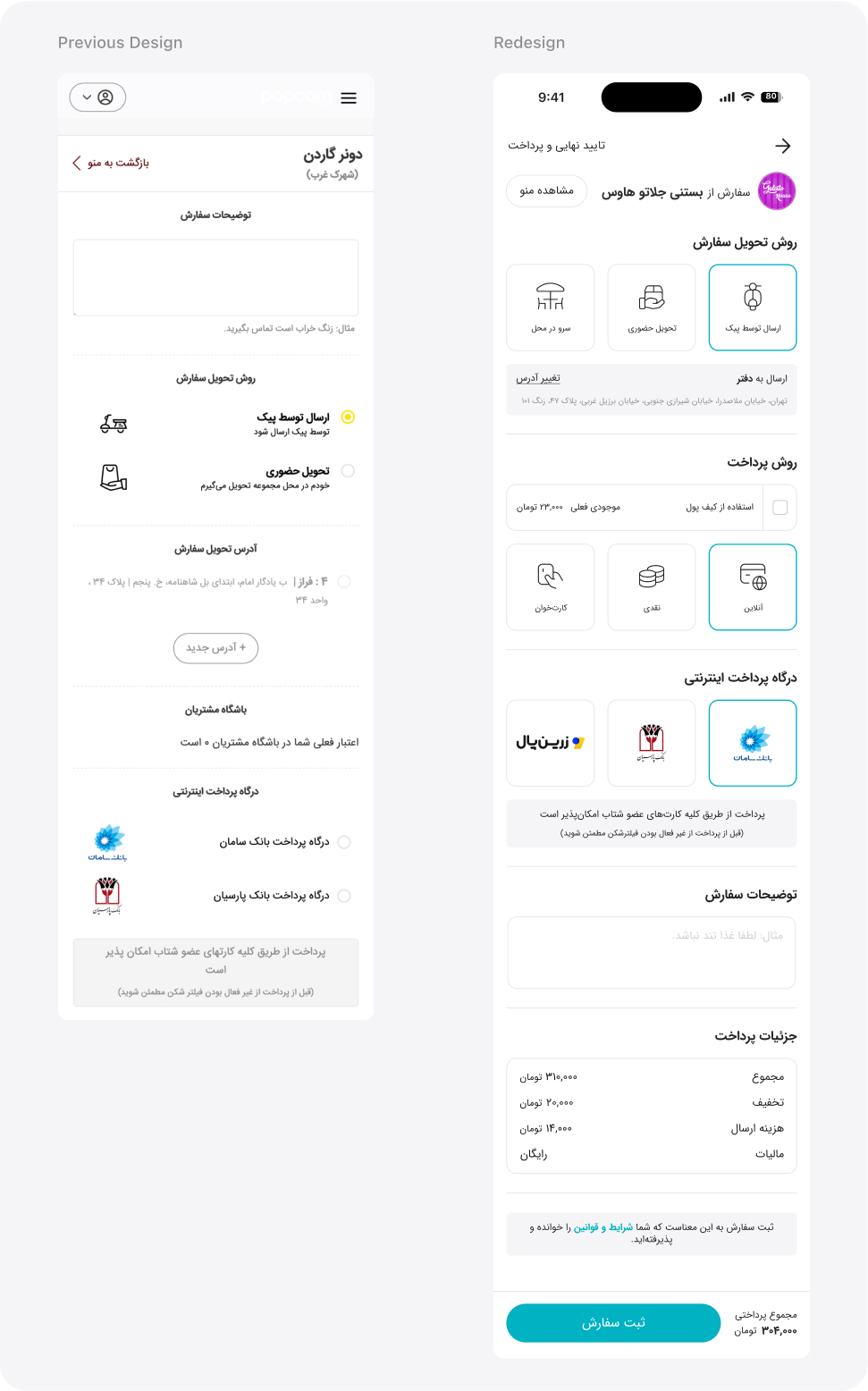
- Enhanced Readability:
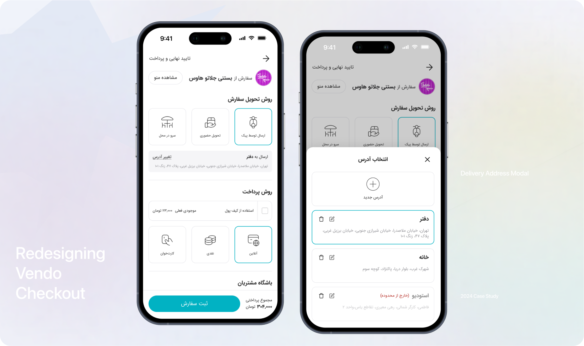
Improved fonts, spacing, and intuitive formats for information like addresses to make it more accessible and reduce user errors. - Integrated Boxes with Icons:
Replaced traditional radio buttons with integrated boxes and icons for better readability and usability.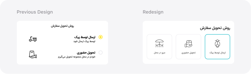
- Redesigned Item Displays:
Aligned item displays and interactive elements with current design trends for a more engaging user experience. - Horizontal View for Selected Items:
Changed the list view of selected items to a horizontal layout to reduce scrolling and improve navigation, especially on mobile devices. - Smart Defaults and Auto-Selection:
Introduced features like pre-selecting common options to minimize clicks and expedite the ordering process. - Checkbox for Rules and Regulations:
Replaced the checkbox with a note under the order confirmation button to reduce interactions and clarify terms acceptance. - Improved Address Display:
Showed only the selected address initially, using a modal for the full list to reduce clutter and improve navigation. - Redesigned Pick-Up Details:
Removed the map preview to reduce scrolling and streamline the interface. - Wallet and Customer Loyalty Integration:
Simplified and integrated these sections into the checkout flow for better visibility and usability. - Dark Mode:
Introduced a dark mode option to enhance visual appeal and comfort in low-light environments. - QR Code Functionality:
Added QR code scanning to streamline dine-in orders and improve efficiency. Order Details Section:
Added a section for order items, prices, and invoice details in the final checkout stage for a clear summary before purchase.
Ideas Not Implemented in the Prototype:
- Preview of shopping cart items in the first checkout section on mobile.
- Step-by-step checkout process with a progress stepper.
- Default selection of “By Delivery” with a modal for changing the method.
- Collapsible list of addresses.
After developing the prototype based on our design solutions, we conducted several rounds of usability testing to ensure the changes effectively addressed the identified problems and met user needs.
Task Scenario:
All participants were asked to complete the entire checkout process, including selecting delivery options, choosing payment methods, finishing an order, and interacting with the redesigned user interface.
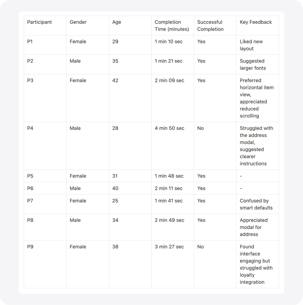
Summary:
Total Participants: 9
- Gender Breakdown: 5 Women, 4 Men
- Age Range: 25-42
- Average Task Completion Time: 2.38 minutes
- Successful Task Completion Rate: 78%
By analyzing this data, we identified areas for further refinement, ensuring our prototype effectively met user needs and improved overall satisfaction with the platform.