

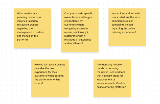
From our analysis and research, we identified the following user needs and problems:
- Multiple Wrong Orderings by Users: Customer service reports indicated that users frequently made errors while placing orders, especially with items that had multiple sizes and toppings, leading to incorrect deliveries and customer dissatisfaction.
- High Rates of User Drops: Significant drop-off rates in the ordering menu indicated a need for a more seamless and engaging user flow.
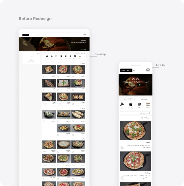
- Unfunctional Menu and Challenges in Finding Preferable Categories and Items: Reports showed that some categories and items were not easily visible to users, resulting in unusually low sales rates.
- Increasing Tendency Among Users Toward Competitors: Users were increasingly turning to competitor platforms, which offered a modern, trendy user interface that our platform lacked.
- Unpractical User Profile: The user profile tab, especially the wallet section, was not interactive enough and needed improvement.
- Lack of Dark Mode: There was a high demand for a dark mode version, which was not available, affecting user satisfaction.
With a clear direction from our brainstorming sessions, we focused on translating the most impactful ideas into actionable design solutions. Our primary objective was to address the key problems identified during the research phase and create a more user-friendly and visually appealing platform.
Approved Design Solutions:
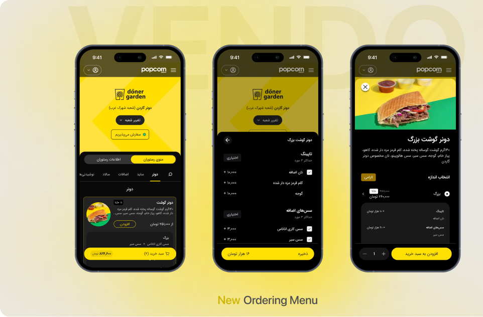
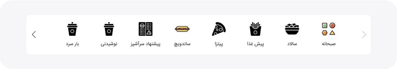
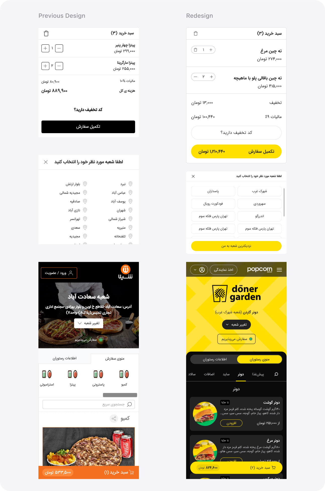
- Vertical Category Tab: For better accessibility of all categories with minimal need for clicks or scrolling, we decided to redesign this section. Among the ideas, we found the vertical arrangement of categories more suitable than a collapsible tab because, on the desktop version, users can see all categories without any clicks and with minimal scrolling, making it easier to access the desired category.
- Multi-Size Options on Initial View:
We streamlined the selection process by moving multi-size options from the item’s modal to the initial view on the desktop. Users can now see and choose different sizes directly from the main menu, reducing the steps needed to complete an order.
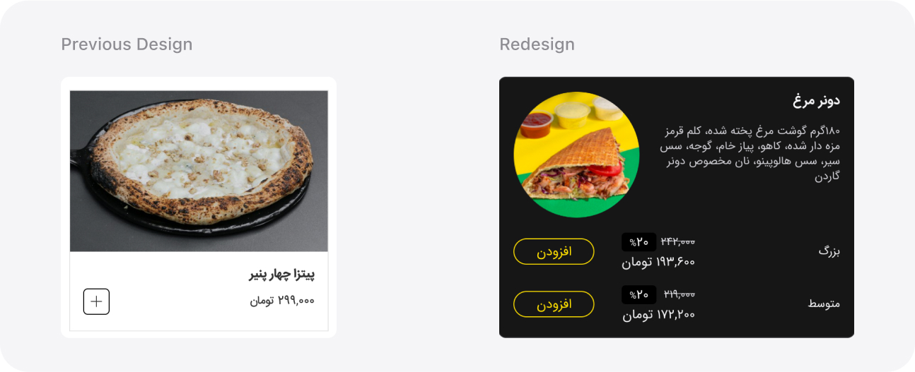
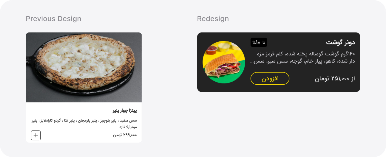
- Redesigned Item Cards:
Item cards were redesigned for better visibility and usability. The new design emphasizes both images and descriptions, features clearer typography, and offers a more organized layout, making it easier for users to find and select their desired items quickly. Additionally, card sizes were reconsidered to enhance accessibility on mobile devices.
- Modernized User Interface:
We overhauled the user interface with a sleek, contemporary design. This involved redesigning all components and modals, enhancing typography for readability, optimizing color schemes for visual coherence, and introducing a dark mode. These improvements were aimed at elevating the overall user experience and addressing the strong demand for a dark mode option.
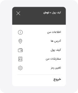
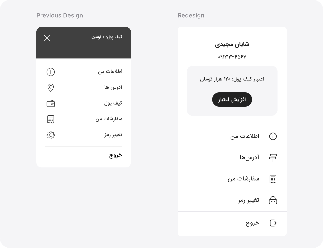
- Interactive User Profile Tab:
The user profile tab was redesigned with enhanced interactivity, focusing on the wallet section. We prominently displayed the credit balance and added a button that leads to a dedicated page for wallet charging and transaction history. This redesign aimed to make it easier for users to manage their profiles and finances, and, of course, encourage them to charge their wallets.
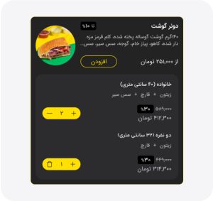
- Expandable Item Cards for Multi-Size Items and Toppings:
When users add a multi-size item or an item with toppings, the item’s card now expands to show a preview. This preview includes the option to add more of the specific selection, helping to prevent ordering errors and improve the overall experience.
We conducted usability testing to evaluate the redesigned features of Vendo. A group of 9 participants, comprising 4 women and 5 men, participated in the testing sessions. The tests were conducted remotely in one day. Each participant was given the same task scenario to perform using the prototype.
Task Scenario:
Order a multi-size pizza with two toppings of your choice. Ensure to view the item details, select the desired sizes and toppings, and proceed to checkout.
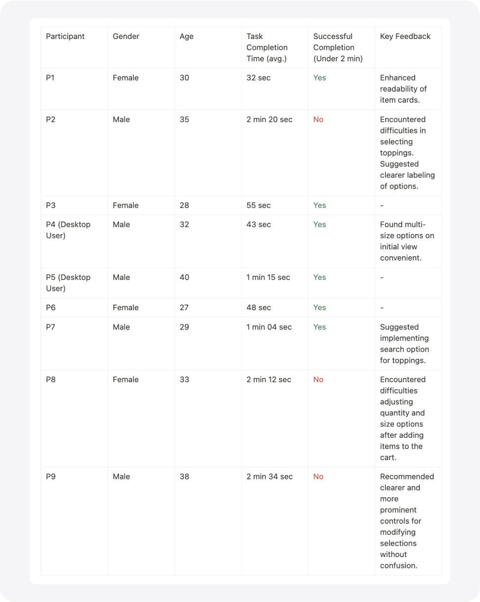
Summary:
- Total Participants: 9
- Gender Breakdown: 4 Women, 5 Men
- Age Range: 27-40
- Average Task Completion Time: 1 min 37 sec
- Successful Task Completion Rate: 67%